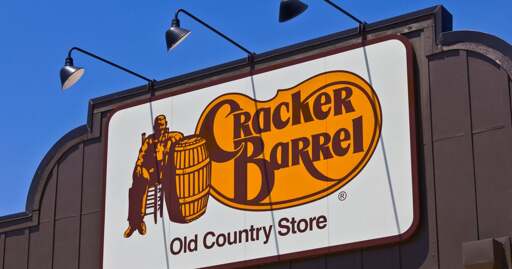
Cracker Barrel stock plunged as much as 15% after the restaurant chain released a new logo that removes its long-time image of a man leaning against a barrel.
All companies eventually cut costs to an absurd amount, even if it goes against the brand with which they started. I would venture to guess that all this started with cutting costs on building new locations and maintaining old ones. They’re fairly large stores and require a lot of decorations in the form of fake, maybe some real, antiques. It’s a restaurant so all these things hanging on the walls need to be cleaned regularly. There is cost in buying decorations, storing them, transporting them, and cleaning them. They have to be replaced if customers break them or they get too dirty. If you’re cutting costs, start with cleaning up the decor. They already did this and that’s them removing part of their brand.
Same with the grand fire places. I’m not sure if newer stores even have the fireplace, but I would bet they don’t. The fireside checkers thing took up space that could go to the kitchen, dining room, or retail areas.
If you’re cleaning up the physical locations, stripping them of detail, you’re changing the brand. Might as well change the logo as well to reflect the new experience. Plus the logo looks cleaner in a mobile website layout, which is definitely where a lot of restaurants are now focusing.
All these modern changes are simply a reflection of economic measures the company takes in order to make more money. They previously trained the customer base to expect one thing, when the company was willing to spend money on it. That is no more. Now the customer base feels betrayed because they don’t look at it from the POV of a c-suite cost-cutter. They just see the customer experience and their memories of mee-maw taking them there for lunch after church when they were 12.
Capitalism creates the conditions to destroy itself.
Everything is become a bland boring mess. Suburban hell is bleak enough but fuck, can we have some variety out here?
But this is uniquely boneheaded. The old logo was distinct on the “Food” highway signs and a huge part of the “comfort” that this company represents for millions of travelers everyday. FFS they could have at least make the logo barrel shaped and it would still look great on mobile without as much backlash.